8 Tips to Design Better Text Input Controls
That will help you create intuitive user input forms
Non-Medium members can read the story here.
Thank you for the fantastic response to my previous article on button design tips. It’s great how these insights have helped so many of you.
Today, I am focusing on another important area of UX design: text input controls in user input forms. While these are minor details, careful design choices for input fields make an impact on the product’s usability.
I will share a few practical tips to help you create intuitive, user-friendly input forms that make data entry easier and more efficient for your users.
1. Don’t use labels as placeholders for input controls
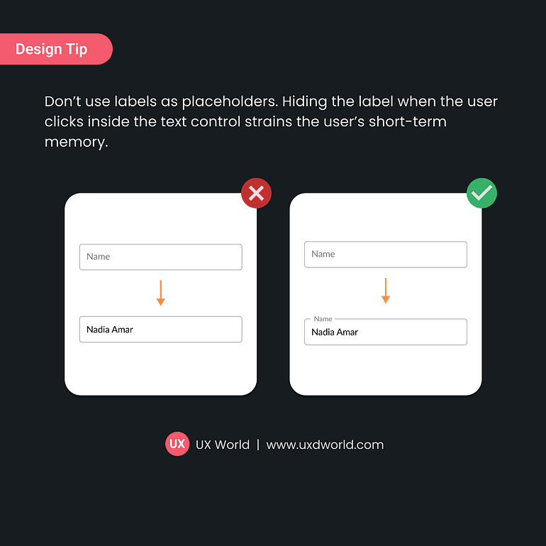
Don’t use labels as placeholders for input controls. Hiding the label when the user clicks inside the text control, strains the user’s short-term memory.
Keeping labels visible makes forms more user-friendly, clear, and accessible.
2. Don’t use lengthy labels
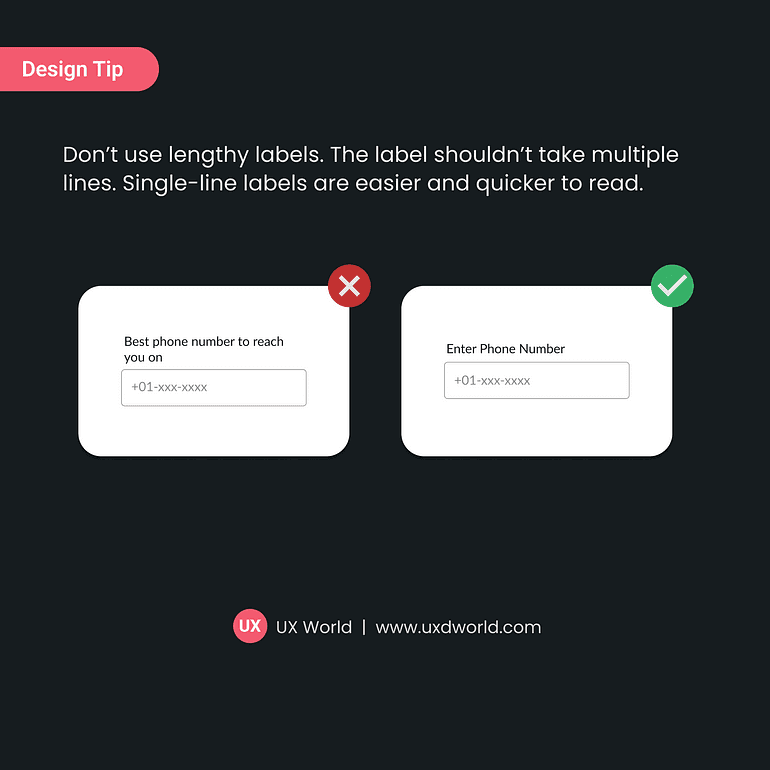
Don’t use lengthy labels. Labels shouldn’t take up multiple lines. It should be kept to a single line.
Use concise and clear language for your labels, ensuring they fit on a single line without losing meaning or clarity.
3. Convey input requirements clearly
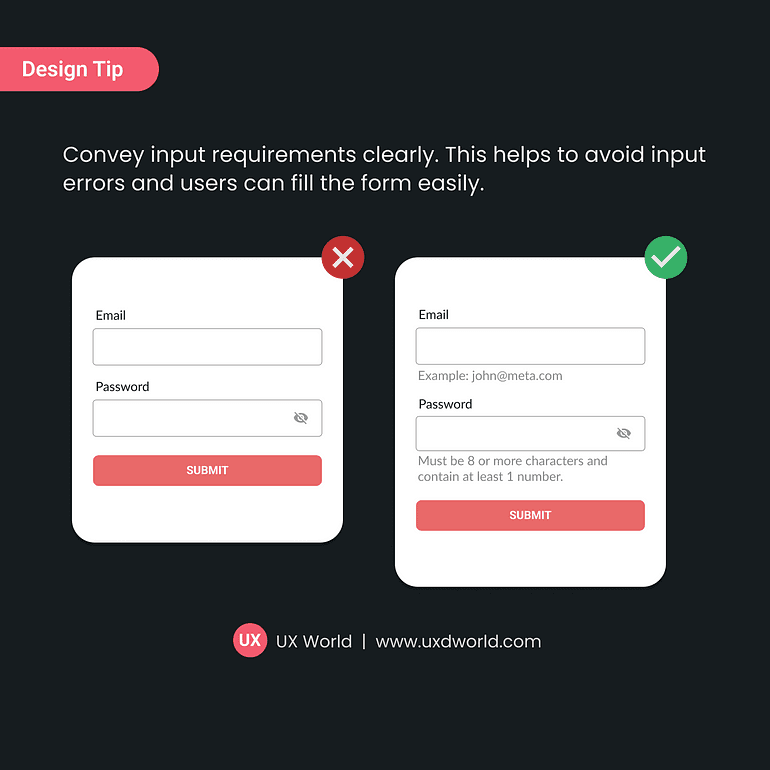
Clearly communicate what kind of information users need to provide in a form.
Place input requirements near the relevant fields (e.g., under the label or inside a tooltip), and use simple and clear language to describe them.
4. Don’t use placeholder text inside control
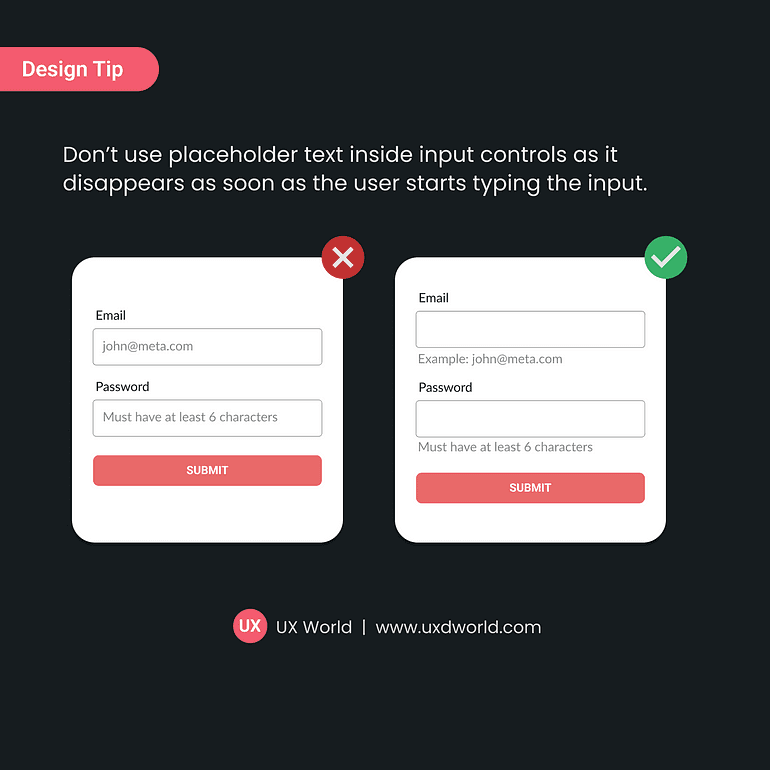
Don’t use placeholder text as it disappears as soon as the user starts typing the input.
Avoiding placeholder text enhances clarity and reduces user frustration, providing a smoother form-filling experience.
5. Use appropriate input controls
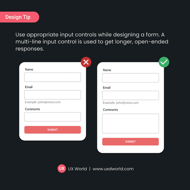
Use appropriate input controls while designing a form for users.
An appropriate input control makes it easier for users to understand how much information they can provide in a field.
6. Mark optional fields only
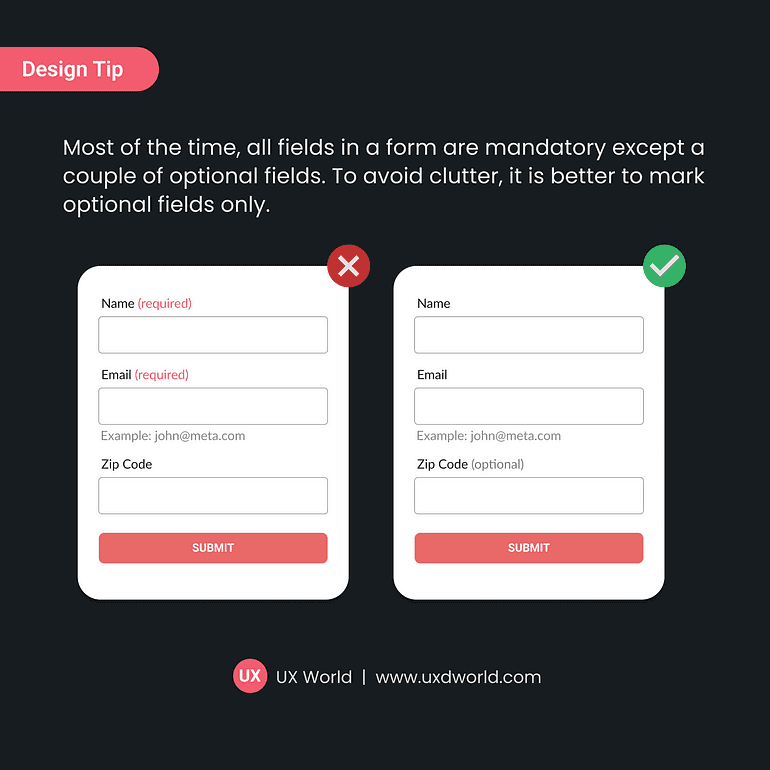
Most of the time, all fields in a form are mandatory except a couple of optional fields. To avoid clutter, it is better to mark optional labels for fields that are not required.
Labeling optional fields instead of mandatory ones reduces form clutter and simplifies the navigation.
7. Adjust input control width
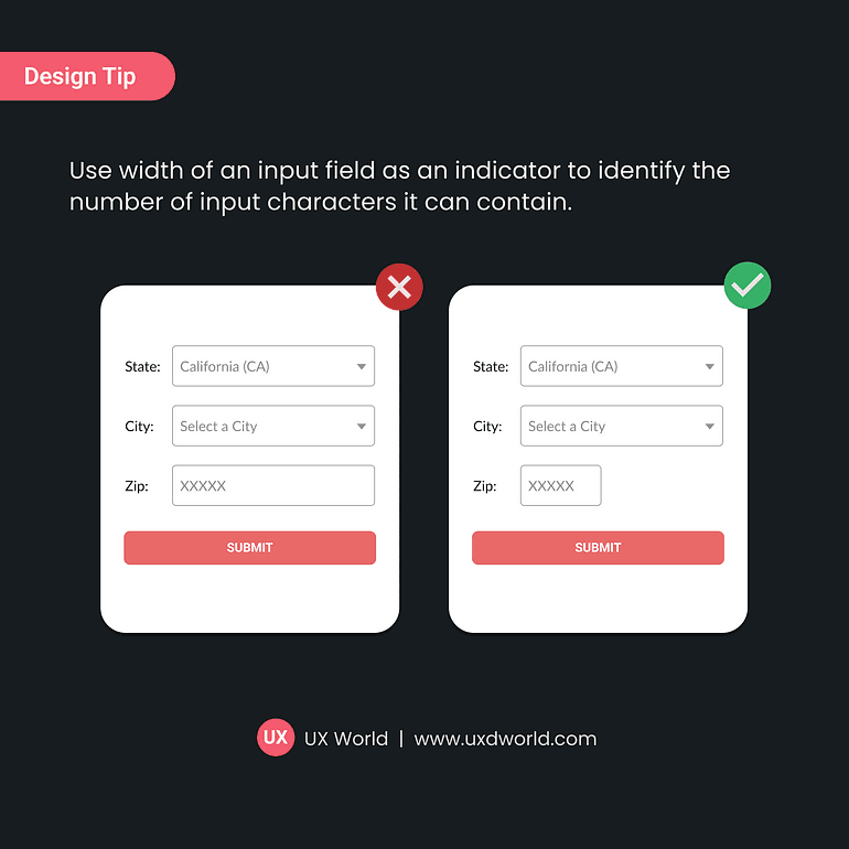
Use the width of an input field as an indicator to identify the number of input characters it can contain.
Adjusting input control width provides users with clear, visual cues about how much information to enter, improving the form usability.
8. Use visual indicators and text to highlight errors
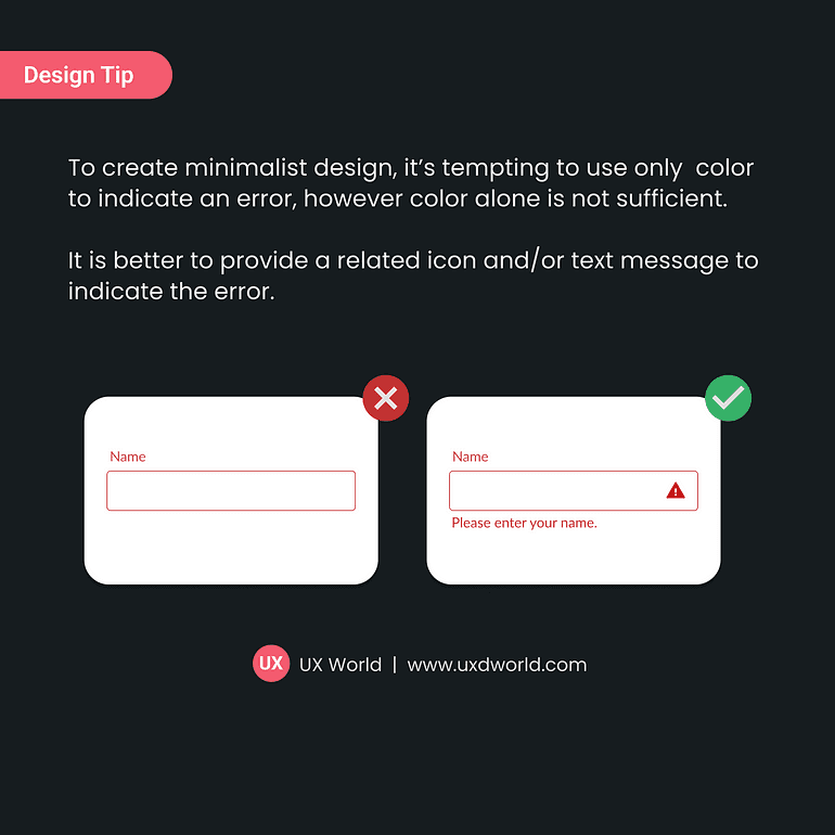
It is tempting to use only color to indicate errors to encourage minimalist design. However, color alone is not sufficient.